All data is anonymous. No personal data is recorded.
This is subject to change as the analytics evolve.
Analytics Event Table
id (string) - Event specific ID
event (enum)- Different types of events and their corresponding properties
- page_load - Triggered on page load
- section_viewed (enum)- Sections viewed include “about”, “experience”, “research”, “contact”
- scroll_depth (enum)- As percentage of the total length of the main page - 25, 50, 75, 100
- link_clicked (enum)- This event is fired anytime a user clicks a link - “planner”, “notes”, “old-site”, “email”, “ayuda”, “youtube”
- nav_clicked (enum) - This event is fired when a user navgiates to sections using the nav links at the top of the site - “about”, “experience”, “research”, “contact”
sessionId (string) - Randomly generated ID for browser session
createdAt (time) - A precise time stamp
service (enum) - We will only be concerned with “main-site” for now
Feedback Table
id (string) - Feedback specific ID
category (enum) - The feedback category selected by the user - “Suggestion”, “Bug Report”, “Other”
message (string) - Max of 500 characters to explain feedback
contact (string) - Just a string, any information could be put into here
service (string) - Currently always “main-site”
createdAt (time) - A precise time stamp
Notes about Data
The AnalyticsEvent table has two different id/createdAt formats mixed together:
main-site events (raw SQL insert) always used gen_random_uuid() for id and Postgres’s NOW() for createdAt — a UUID and microsecond-precision timestamp.
trip-planner events (via Prisma) used Prisma’s client-side cuid() and Date.now() defaults instead of the database — a cuid and only millisecond-precision timestamp.
This got fixed at the schema level (trip-planner/prisma/schema.prisma now uses dbgenerated("gen_random_uuid()") / dbgenerated("now()") for both fields, so new trip-planner rows match main-site’s format exactly). But a schema default only changes future inserts — rows written before the fix keep their original cuid/millisecond format forever. So any notebook reading this table needs to tolerate both formats existing side by side in the same column.
Tools and Techniques
Everything below builds on a small set of Python libraries and a handful of core data-mining concepts. This section is a quick reference for what each one does and why it’s useful - skip ahead if you’re already familiar, or come back here whenever a technique further down feels unfamiliar.
Core libraries
Library
Role
pandas
Loads, filters, groups, and reshapes tabular data (DataFrames). Nearly every cell below starts by transforming raw event rows into a per-session table.
matplotlib
Draws every chart in this notebook - box plots, scatter matrices, dendrograms, ROC curves.
scikit-learn
Supplies the classifiers, clustering algorithms, evaluation metrics, and hyperparameter search tools used throughout.
scipy
Used once, for hierarchical clustering’s dendrogram.
Why turn raw events into a “session table”?
Data-mining algorithms expect one row per observation, one column per feature - a shape pandas calls “tidy.” The raw AnalyticsEvent table is one row per event (a single session might have 20 rows). The session_metrics table built in Classifying Contact Interest collapses that down to one row per session, with engineered columns like total_actions and max_scroll_depth. That reshaping step is what makes every classifier, clustering algorithm, and association-rule search below possible.
Supervised learning: classifiers
These all answer the same question - “given a session’s features, predict whether it shows contact_interest” - using different strategies:
Classifier
How it decides
Why it’s here
Decision Tree
Asks a sequence of yes/no questions about one feature at a time.
Easy to read and explain - the whole “reasoning” can be printed as text or drawn as a diagram.
K-Nearest Neighbors (KNN)
Looks at the k most similar past sessions and votes.
No training step, and very sensitive to feature scale - a good teaching example for why scaling matters.
Random Forest
Averages many decision trees, each trained on a random subset of the data.
Usually more accurate and more resistant to overfitting than a single tree.
Bagging
The same “average many models” idea as Random Forest, but with a base model you choose yourself.
Shows that ensembling is a separate idea from decision trees specifically - it works with any base classifier.
Gaussian Naive Bayes
Assumes each feature is normally distributed within a class, and combines their probabilities.
Extremely fast with no hyperparameters to tune - a useful “does anything more complex actually help?” comparison point.
Dummy (baseline)
Always predicts the majority class, ignoring the features entirely.
The floor every real classifier has to beat. If a “real” classifier can’t outperform this, it isn’t learning anything from the data.
Evaluating a classifier
A single accuracy number can be misleading, especially once one class is rarer than the other:
Metric / technique
What it tells you
Accuracy
Percent of predictions that were correct. Misleading on unbalanced data - a classifier that always guesses the majority class can still score high.
Confusion matrix
Breaks predictions into true/false positives and negatives, so you can see what kind of mistake a classifier makes.
Precision
Of the sessions predicted contact_interest, how many actually were? High precision means few false alarms.
Recall
Of the sessions that actually were contact_interest, how many did the classifier catch? High recall means few missed cases.
F1 score
A single number balancing precision and recall.
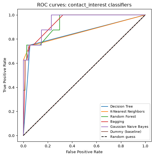
ROC curve
Plots true-positive rate against false-positive rate across every possible decision threshold - a way to compare classifiers independent of any one threshold choice.
Train/test split
Trains on part of the data, tests on data the model never saw, so the resulting accuracy reflects generalization rather than memorization.
k-fold cross-validation
Repeats the train/test split k times with different slices, giving a distribution of scores instead of one number that depends on how a single split happened to land.
Feature engineering and hyperparameter search
Technique
What it does
Why it matters
Feature scaling (StandardScaler)
Rescales every feature to a comparable range.
Distance-based methods (KNN, clustering) would otherwise let whichever feature has the largest raw numbers dominate.
GridSearchCV
Systematically tries every combination in a set of hyperparameters and cross-validates each one.
Replaces manual trial-and-error with an exhaustive, repeatable search.
Unsupervised learning: finding structure without labels
Unlike the classifiers above, these don’t use contact_interest at all - they look for structure in the session features alone:
Technique
What it finds
Why it’s here
K-means
Splits sessions into k groups, each centered on a mean point.
Formalizes the “user persona” idea from Visualizing the Data - do sessions naturally fall into a few behavioral types?
Hierarchical clustering / dendrogram
Builds a tree of nested groupings, from every session as its own cluster up to one big cluster.
Doesn’t require picking k in advance, and the dendrogram is genuinely readable at this dataset’s small size.
DBSCAN
Groups points that are densely packed together, and labels sparse points as noise.
A different definition of “cluster” - density-based instead of distance-to-center-based.
Anomaly detection (Robust Covariance, One-Class SVM, Local Outlier Factor)
Flags the sessions that look least like the rest.
Useful for catching bot traffic or unusually extreme sessions, not for finding groups.
Association analysis
Frequent itemsets and association rules answer a different kind of question entirely - not “predict a label” or “find groups,” but “which behaviors tend to occur together?” (e.g. “sessions that scroll to 100% also tend to click Contact”). See Association Analysis for how this gets adapted to session data.
Importing the Data
We load the raw AnalyticsEvent export, normalize the two timestamp/id formats described above into one consistent shape, then narrow down to main-site events only and treat event as a categorical column so the rest of the notebook can group and count by event type cleanly.
Show code
%matplotlib inlineimport jsonimport matplotlib.pyplot as pltimport numpy as npimport pandas as pdfrom sklearn.cluster import KMeansfrom sklearn.decomposition import PCAfrom sklearn.preprocessing import StandardScaler# Read the csv as a Pandas table# (the data-dump pipeline writes CSVs under notes/notebooks/data/ - see CLAUDE.md -# shared by both draft and published notebooks)events = pd.read_csv("data/analytics_event.csv")# Show the table as it is read inevents
id
event
properties
sessionId
createdAt
service
0
cmqqq040x001jqgjo2poi6ym1
page_load
{}
miki8egczbrmqqq03qr
2026-06-23 07:09:06.603-07
trip-planner
1
cmqqqskt2001kqgjoq3j1u21j
page_load
{}
fvr6awmbhy5mqqqsjvo
2026-06-23 07:31:14.717-07
trip-planner
2
cmqqqtror001lqgjoajbjzrhv
page_load
{}
z9a2kc0k9simqqqtr9a
2026-06-23 07:32:10.346-07
trip-planner
3
cmqqs41zx001mqgjox4soj63v
page_load
{}
d4tpym359nvmqqs41w3
2026-06-23 08:08:09.772-07
trip-planner
4
4e55128c-2284-49a9-b8cb-7104c20870c2
page_load
{}
ayv6yrctjgmqqzlb90
2026-06-23 11:37:34.118451-07
main-site
...
...
...
...
...
...
...
2311
bc71c7fb-fb65-4d59-8eaa-958eac3af04d
page_load
{"tool": "home"}
k8x5wxubokmv09x2gk
2026-10-08 18:15:22.058101-07
quantum
2312
fe1096ff-64f4-448a-a9f9-54c01997a8f4
page_load
{"page": "atlas"}
61bzmctmth6mv0l8r1b
2026-10-08 23:32:22.80349-07
main-site
2313
7d91ac70-5390-4eda-b390-ea234472af24
page_load
{"tool": "home"}
kfq998r41fmv0ys12b
2026-10-09 05:51:17.327784-07
quantum
2314
fe6b861b-943d-4d0a-a0d8-2b1638129e80
page_load
{"tool": "home"}
37opms02katmv10jydf
2026-10-09 06:40:59.832985-07
quantum
2315
e5eabde4-42fc-4d15-9680-c18625017dca
page_load
{}
qmyd3h1ee28mv12j59u
2026-10-09 07:36:21.316821-07
sky
2316 rows × 6 columns
Show code
# Normalize the different time formats to meet ISO8601events["createdAt"] = pd.to_datetime(events["createdAt"], format="ISO8601", utc=True)# parse the json propertiesevents["properties"] = events["properties"].apply(json.loads)# Print the total amounts of events an serviceprint(f"{len(events)} events, {events['service'].nunique()} services")# show the amounts of each type of service... We are only concerned with mainsiteevents["service"].value_counts()
# Confirm both id/timestamp eras are actually present, and that parsing didn't drop anything.# Not every render has both eras - a fresh/sparse local dev database may only have one# (or neither), so this reports what's actually present instead of assuming a full# production-shaped history.old_era = events[events["id"].str.startswith("cm")] # trip-planner cuid eranew_era = events[~events["id"].str.startswith("cm")] # gen_random_uuid eraiflen(old_era) >0: sample_old = old_era.iloc[0]print("cuid era :", sample_old["id"], sample_old["createdAt"])else:print("cuid era : none present in this dataset")iflen(new_era) >0: sample_new = new_era.iloc[0]print("uuid/NOW era :", sample_new["id"], sample_new["createdAt"])else:print("uuid/NOW era : none present in this dataset")assert events["createdAt"].isna().sum() ==0, "some timestamps failed to parse"
cuid era     : cmqqq040x001jqgjo2poi6ym1 2026-06-23 14:09:06.603000+00:00
uuid/NOW era : 4e55128c-2284-49a9-b8cb-7104c20870c2 2026-06-23 18:37:34.118451+00:00
Show code
# Now we can strip out the trip planner datamain_site = events[events["service"] =="main-site"].copy()# Show the top 5 results from the tablemain_site.head()
id
event
properties
sessionId
createdAt
service
4
4e55128c-2284-49a9-b8cb-7104c20870c2
page_load
{}
ayv6yrctjgmqqzlb90
2026-06-23 18:37:34.118451+00:00
main-site
7
94f66e36-2ce1-4392-a213-828fa36ae170
page_load
{}
nj17pvtvly9mqr3jd1j
2026-06-23 20:28:00.434174+00:00
main-site
17
81e9c854-83db-4f14-b360-6413b4ef530f
page_load
{}
slx8anuwuremqrbc4do
2026-06-24 00:06:19.830965+00:00
main-site
18
220eb49f-c8d6-463e-b087-bc33ed2273cc
page_load
{}
9ewxvfuudiamqrcx5vv
2026-06-24 00:50:40.628926+00:00
main-site
19
7e505a28-f0ab-4459-941b-576546fd77ed
page_load
{}
q25txt5b7zmqre5eto
2026-06-24 01:25:05.179063+00:00
main-site
Show code
# confirm column data typesmain_site.dtypes
id                            str
event                         str
properties                 object
sessionId                     str
createdAt     datetime64[us, UTC]
service                       str
dtype: object
Show code
# change event type to categorical to associate an integer with the namesmain_site.event = main_site.event.astype('category')
Show code
main_site.dtypes
id                            str
event                    category
properties                 object
sessionId                     str
createdAt     datetime64[us, UTC]
service                       str
dtype: object
Visualizing the Data
A first look at how people actually use the site: how long sessions last, how many actions they trigger, and how far they scroll - each shown as a box-and-whisker plot with the underlying numbers spelled out in prose below it.
Show code
# 1. Find the start and end time for each sessionsession_times = main_site.groupby('sessionId')['createdAt'].agg(['min', 'max'])# 2. Calculate duration in minutessession_times['duration_minutes'] = (session_times['max'] - session_times['min']).dt.total_seconds() /60.0# 3. Cap duration for these visualizations only - a single session with an idle open# tab can run for hours and swamps the scale of a box plot / scatter matrix. 100# minutes is a generous cap for someone actually reading the site. This only affects# the charts below - the classifier later in this notebook still trains on the real,# uncapped duration.DURATION_CAP_MINUTES =100session_times['duration_minutes'] = session_times['duration_minutes'].clip(upper=DURATION_CAP_MINUTES)# 4. Create the boxplotsession_times.boxplot(column='duration_minutes')
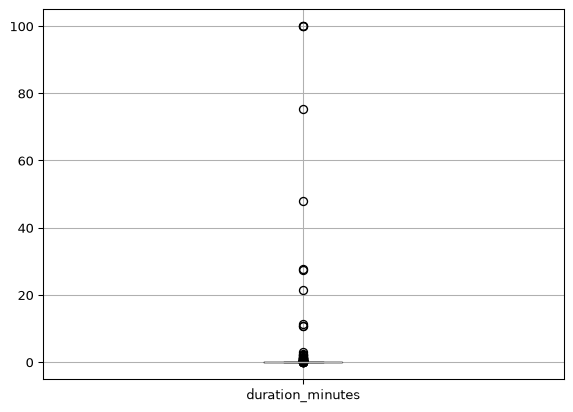
Reading the box plot: the box spans the 1st to 3rd quartile, the green line marks the median, and the whiskers show the normal range of the data - circled points beyond them are outliers. Duration here is capped at 100 minutes (see the code above) so a rare session where someone left the tab open for hours doesn’t flatten the whole chart.
Show code
# 1. Calculate the components dynamicallystats = session_times['duration_minutes'].describe()median_val = stats['50%']q1_val = stats['25%']q3_val = stats['75%']max_val = stats['max']# 2. Format the dynamic print statementprint(f"Therefore, we can conclude that a typical user session duration is {median_val:.2f} minutes (the median).\n"f"The middle 50% of our users stay between {q1_val:.2f} and {q3_val:.2f} minutes (the box range).\n"f"The chart above caps duration at {DURATION_CAP_MINUTES} minutes, so the {max_val:.2f} minute maximum shown\n"f"here is the capped value, not the true longest session - a handful of real sessions run far longer\n"f"than that (people who leave the tab open), which is exactly why the cap exists.\n\n"f"We most also take into consideration that the duration is calculated by the first and last event per session.\n"f"This means that a user could stay on the page for some time after without triggering another event.")
Therefore, we can conclude that a typical user session duration is 0.00 minutes (the median).
The middle 50% of our users stay between 0.00 and 0.02 minutes (the box range).
The chart above caps duration at 100 minutes, so the 100.00 minute maximum shown
here is the capped value, not the true longest session - a handful of real sessions run far longer
than that (people who leave the tab open), which is exactly why the cap exists.

We most also take into consideration that the duration is calculated by the first and last event per session.
This means that a user could stay on the page for some time after without triggering another event.
Show code
# 1. Count how many events happen in each sessionsession_counts = main_site.groupby('sessionId').size().reset_index(name='event_count')# 2. Boxplot the distribution of activitysession_counts.boxplot(column='event_count')
Show code
# 1. Calculate the components dynamicallystats = session_counts['event_count'].describe()median_val = stats['50%']q1_val = stats['25%']q3_val = stats['75%']max_val = stats['max']# 2. Format the dynamic print statementprint(f"Therefore, we can conclude that a typical user session consists of {median_val:.2f} events (the median).\n"f"The middle 50% of our users trigger between {q1_val:.2f} and {q3_val:.2f} events (the box range).\n"f"While the absolute maximum recorded activity was {max_val:.2f} events, the whiskers show the normal\n"f"range of data, meaning extreme high values are likely just click-happy users.")
Therefore, we can conclude that a typical user session consists of 1.00 events (the median).
The middle 50% of our users trigger between 1.00 and 2.00 events (the box range).
While the absolute maximum recorded activity was 19.00 events, the whiskers show the normal
range of data, meaning extreme high values are likely just click-happy users.
Show code
# 1. Filter for scroll eventsscroll_data = main_site[main_site['event'] =='scroll_depth'].copy()# 2. Extract the number from the JSON string safelydef extract_percent(prop_str):try:# If it's already a dict, grab it; if it's a string, parse it as JSONifisinstance(prop_str, dict):return prop_str.get('percent') data = json.loads(prop_str)return data.get('percent')except (json.JSONDecodeError, TypeError, AttributeError):returnNonescroll_data['depth'] = scroll_data['properties'].apply(extract_percent)# 3. Ensure it is numericscroll_data['depth'] = pd.to_numeric(scroll_data['depth'], errors='coerce')# 4. Create the plot! # (We drop 'by=sessionId' here to avoid the ugly X-axis problem)plt.figure(figsize=(6, 6))scroll_data.boxplot(column='depth')plt.title("Overall User Scroll Depth Distribution")plt.ylabel("Scroll Percentage (%)")plt.show()
Show code
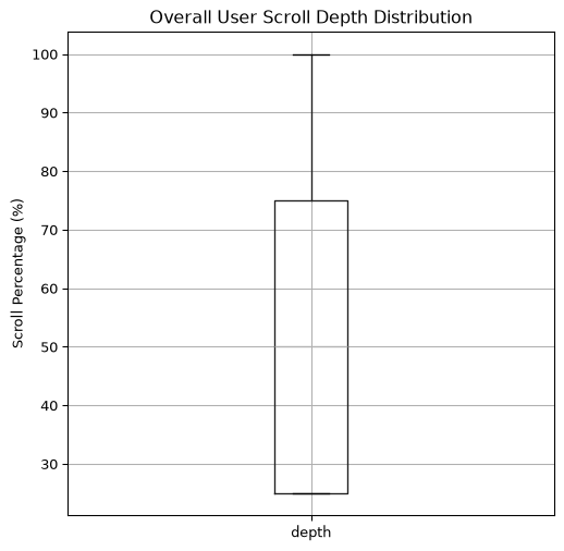
# 1. Calculate the components dynamicallystats = scroll_data['depth'].describe()median_val = stats['50%']q1_val = stats['25%']q3_val = stats['75%']max_val = stats['max']# 2. Format the dynamic print statementprint(f"Therefore, we can conclude that a typical user scrolls to {median_val:.1f} % (the median) of the main page.\n"f"The middle 50% of our users scroll between {q1_val:.1f} and {q3_val:.1f} events (the box range).")
Therefore, we can conclude that a typical user scrolls to 50.0 % (the median) of the main page.
The middle 50% of our users scroll between 25.0 and 75.0 events (the box range).
Show code
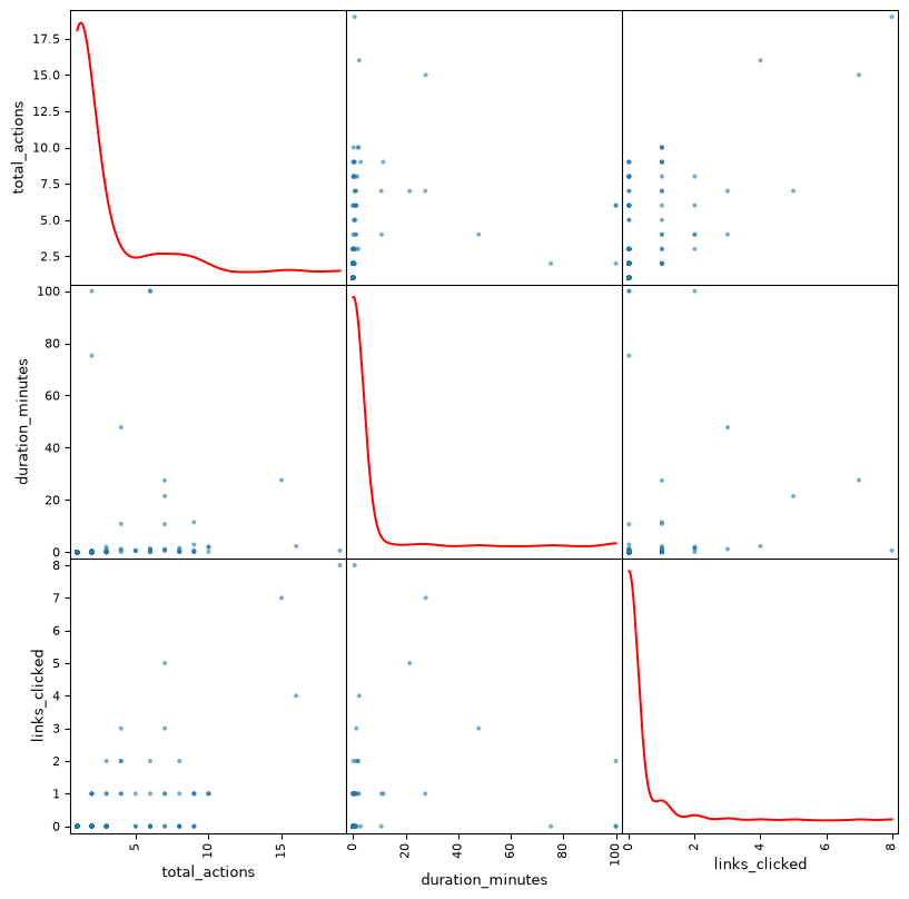
# 1. Create a clean metrics DataFrame per session# Total events per sessionsession_metrics = main_site.groupby('sessionId').size().reset_index(name='total_actions')# Session duration in minutestimes = main_site.groupby('sessionId')['createdAt'].agg(['min', 'max'])session_metrics['duration_minutes'] = ((times['max'] - times['min']).dt.total_seconds() /60.0).values# Count how many links were clicked in each sessionlink_clicks = main_site[main_site['event'] =='link_clicked'].groupby('sessionId').size()session_metrics['links_clicked'] = session_metrics['sessionId'].map(link_clicks).fillna(0)# 2. Drop the sessionId column (since it's text) just for the plot, and cap duration the# same way as the box plot above. This clips a copy used only for the chart -# session_metrics itself stays uncapped, since the classifier later in this notebook# trains on the real duration.plot_data = session_metrics[['total_actions', 'duration_minutes', 'links_clicked']].copy()plot_data['duration_minutes'] = plot_data['duration_minutes'].clip(upper=DURATION_CAP_MINUTES)# 3. Generate the Scatter Matrix!# Needs at least a couple of sessions with values in every column, or pandas' internal# min/max range calculation blows up on an empty array - a fresh/sparse local dev# database (few or no main-site sessions yet) can hit that, so this adapts the same way# the classifier evaluation cell further down does.# (The '_ =' syntax just suppresses messy text output in Jupyter notebooks)iflen(plot_data.dropna()) >=2: _ = pd.plotting.scatter_matrix( plot_data, diagonal='kde', figsize=(10, 10), alpha=0.6, # Makes dots slightly transparent to see overlaps density_kwds={'color': 'red'} # Color the KDE lines red ) plt.show()else:print(f"Only {len(plot_data)} session(s) available - too few to plot a scatter matrix.")
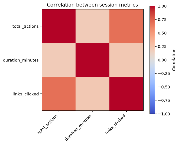
A correlation matrix, visualized as a heatmap - warmer colors mean two metrics move together more strongly. The prose below walks through what these numbers mean for links_clicked and total_actions specifically.
# 1. Calculate correlations and statistics dynamicallycorr_matrix = plot_data.corr()stats = plot_data.describe()# Extract key summary metricsmedian_duration = stats.loc['50%', 'duration_minutes']median_actions = stats.loc['50%', 'total_actions']max_duration = stats.loc['max', 'duration_minutes']# Pull individual correlation coefficients (ranges from -1 to 1)click_duration_corr = corr_matrix.loc['links_clicked', 'duration_minutes']actions_duration_corr = corr_matrix.loc['total_actions', 'duration_minutes']# Dynamically evaluate the relationship between link clicks and time on siteif click_duration_corr >0.5: feature_value_desc ="strong positive relationship. This proves that clicking links directly drives user retention and keeps people on the site longer"elif click_duration_corr >0.1: feature_value_desc ="slight positive relationship, showing some connection between link engagement and session length"else: feature_value_desc ="weak or non-existent relationship. This suggests that link clicks don't impact how long someone stays, meaning they might be clicking an external link and leaving immediately"# Dynamically analyze user personas based on action vs duration correlationif actions_duration_corr >0.6: persona_desc ="highly consistent. Users are steadily interacting with the site the entire time they are here (Classic Explorers)."else: persona_desc ="fragmented. We have a mix of rapid-fire clickers alongside users who generate very few actions over long stretches of time (Window Shoppers vs. Idle Tabs)."# 2. Format the dynamic print statementprint(f"--- EXECUTIVE SUMMARY OF USER BEHAVIOR ---\n\n"f"Based on our session metrics, a typical user experience lasts for {median_duration:.4f} minutes "f"and generates {median_actions:.2f} total actions.\n\n"f"1. IDENTITY USER PERSONAS\n"f"The relationship between total activity and duration tells us our audience personas are {persona_desc}\n\n"f"2. DISCOVER FEATURE VALUE\n"f"When looking at link engagement, there is a {feature_value_desc}.\n\n"f"3. SEE YOUR 'AVERAGE' USER EXPERIENCE\n"f"Looking at the distribution curves, the shape of our traffic shows how varied our audience is. "f"While our median session length sits comfortably at {median_duration:.4f} minutes, the longest session "f"shown here reached {max_duration:.4f} minutes (this chart is capped at {DURATION_CAP_MINUTES} minutes - "f"see the code above). This spread reveals the true 'shape' of our user base—separating "f"the quick bounce traffic from the deeply engaged power users who exhaustively browse the site.")
--- EXECUTIVE SUMMARY OF USER BEHAVIOR ---

Based on our session metrics, a typical user experience lasts for 0.0000 minutes and generates 1.00 total actions.

1. IDENTITY USER PERSONAS
The relationship between total activity and duration tells us our audience personas are fragmented. We have a mix of rapid-fire clickers alongside users who generate very few actions over long stretches of time (Window Shoppers vs. Idle Tabs).

2. DISCOVER FEATURE VALUE
When looking at link engagement, there is a slight positive relationship, showing some connection between link engagement and session length.

3. SEE YOUR 'AVERAGE' USER EXPERIENCE
Looking at the distribution curves, the shape of our traffic shows how varied our audience is. While our median session length sits comfortably at 0.0000 minutes, the longest session shown here reached 100.0000 minutes (this chart is capped at 100 minutes - see the code above). This spread reveals the true 'shape' of our user base—separating the quick bounce traffic from the deeply engaged power users who exhaustively browse the site.
Classifying Contact Interest
session_metrics above already looks like a supervised learning setup: numeric features per session (total_actions, duration_minutes, links_clicked) with an obvious target missing. Nothing in this schema hands us a class to predict — so let’s engineer one instead of only clustering.
Label: did the session ever show interest in the Contact section — i.e. a section_viewed or nav_clicked event with section: "contact"? That’s a reasonable proxy for “this visitor was interested enough to consider reaching out,” and it turns the same session-level features into a decision tree classification problem.
Show code
# 1. Add max scroll depth reached per session as another behavioral featuremax_scroll = scroll_data.groupby('sessionId')['depth'].max()session_metrics['max_scroll_depth'] = session_metrics['sessionId'].map(max_scroll).fillna(0)# 2. Label each session: did it ever show interest in the Contact section?contact_events = main_site[main_site['event'].isin(['section_viewed', 'nav_clicked'])]# .apply() on an empty Series returns a result that doesn't line up as a boolean mask# (indexing with it collapses to a 0-column frame), so a sparse/empty local dev dataset# needs this handled explicitly rather than falling through to the apply/filter below.iflen(contact_events) >0: is_contact = contact_events['properties'].apply(lambda p: p.get('section') =='contact') contact_sessions =set(contact_events[is_contact]['sessionId'])else: contact_sessions =set()session_metrics['contact_interest'] = session_metrics['sessionId'].isin(contact_sessions)session_metrics[['sessionId', 'total_actions', 'duration_minutes', 'links_clicked', 'max_scroll_depth', 'contact_interest']]
sessionId
total_actions
duration_minutes
links_clicked
max_scroll_depth
contact_interest
0
00bsroi4eesdbmrk9eb4n
1
0.000000
0.0
0.0
False
1
010syba918vnemtnnzpxy
1
0.000000
0.0
0.0
False
2
03gvoia5f6i8msg8xxsy
1
0.000000
0.0
0.0
False
3
0brdpxf1ghbomqzjqplv
1
0.000000
0.0
0.0
False
4
0e2kau1yk6pmt6kifwg
1
0.000000
0.0
0.0
False
...
...
...
...
...
...
...
501
zibdt9s92bemqu5usva
1
0.000000
0.0
0.0
False
502
zoarkshcbimqxb7b2e
2
0.000069
0.0
0.0
False
503
zp3lnqs8s2emubj6kp5
1
0.000000
0.0
0.0
False
504
ztk0odbt8fsmr8hq4ok
1
0.000000
0.0
0.0
False
505
zwl6hocmtnmreaq821
5
0.730516
0.0
50.0
False
506 rows × 6 columns
Each row above is one session with its behavioral features (total_actions, duration_minutes, links_clicked, max_scroll_depth) alongside the engineered contact_interest label - this is the exact table the classifier below is trained on.
Show code
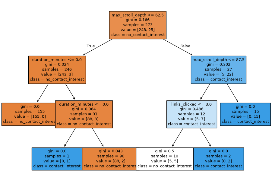
import sklearn.tree# 1. Pick the behavioral features and the engineered labelfeature_cols = ['total_actions', 'duration_minutes', 'links_clicked', 'max_scroll_depth']X = session_metrics[feature_cols].valuesy = session_metrics['contact_interest'].astype(int).values# 2. Fit a shallow decision tree (kept shallow so it stays readable while the dataset is small).# Needs at least one main-site session to fit at all - a fresh/empty local dev database can# have zero, so this (and the two cells below that depend on contact_classifier) adapt the# same way the rest of this notebook does.iflen(session_metrics) >0: contact_classifier = sklearn.tree.DecisionTreeClassifier(max_depth=3) contact_classifier.fit(X, y)# 3. Explain the tree as textprint(sklearn.tree.export_text(contact_classifier, feature_names=feature_cols))else: contact_classifier =Noneprint("No main-site sessions available - skipping the decision tree.")
# Visualize the same treeif contact_classifier isnotNone: plt.figure(figsize=(12, 8)) _ = sklearn.tree.plot_tree( contact_classifier, feature_names=feature_cols, class_names=['no_contact_interest', 'contact_interest'], filled=True )else:print("No classifier to visualize.")
Reading the tree: each split asks a yes/no question about one feature - true goes left, false goes right. class: 1 (contact_interest) leaves show in a warmer shade in the plot above, class: 0 in a cooler one. The text dump above and this plot describe the exact same tree; the plot’s easier to scan, the text is easier to copy or quote.
Evaluating the Classifier
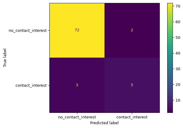
Accuracy alone can be misleading, so this checks the tree’s held-out accuracy alongside a confusion matrix - see Tools and Techniques for what each metric means.
Show code
# How good is the classifier? This adapts to however much data actually exists at render# time below a per-class threshold a held-out split isn't meaningful, so we fall back to training accuracy.from sklearn.model_selection import train_test_splitif contact_classifier isNone:print("No classifier to evaluate.")else: class_counts = session_metrics['contact_interest'].value_counts() min_class_count = class_counts.min() min_per_class_for_split =10if min_class_count >= min_per_class_for_split: X_train, X_test, y_train, y_test = train_test_split( X, y, test_size=0.3, stratify=y, random_state=42 ) eval_classifier = sklearn.tree.DecisionTreeClassifier(max_depth=3) eval_classifier.fit(X_train, y_train) accuracy = eval_classifier.score(X_test, y_test)from sklearn.metrics import ConfusionMatrixDisplay ConfusionMatrixDisplay.from_estimator( eval_classifier, X_test, y_test, display_labels=['no_contact_interest', 'contact_interest'] ) plt.show()print(f"{len(session_metrics)} sessions available ({class_counts.to_dict()} by class) - "f"enough per class to hold out a test set.\n"f"Trained on {len(X_train)}, tested on {len(X_test)} held-out sessions.\n"f"Held-out accuracy: {accuracy:.2f}" )else: accuracy = contact_classifier.score(X, y)print(f"Only {len(session_metrics)} sessions available ({class_counts.to_dict()} by class) - "f"too few per class to hold out a meaningful test set.\n"f"Training accuracy (read skeptically - not a generalization estimate): {accuracy:.2f}" )
506 sessions available ({False: 461, True: 45} by class) - enough per class to hold out a test set.
Trained on 354, tested on 152 held-out sessions.
Held-out accuracy: 0.96
Note on the accuracy above: like every other cell in this notebook, this reruns against whatever AnalyticsEvent rows actually exist at render time - local dev data when run locally, real production data at each publish:notes build (see CI). The evaluation cell adapts to that automatically: below a per-class sample threshold it falls back to training accuracy, which should be read skeptically (the tree is being scored on data it already saw); once enough sessions accumulate per class in production, it switches to a genuine held-out train/test split instead.
Precision, recall, and F1 give a fuller picture than accuracy alone, especially since one class may end up rarer than the other once real production data accumulates.
Show code
from sklearn.metrics import precision_score, recall_score, f1_scoreif contact_classifier isnotNoneand min_class_count >= min_per_class_for_split: predicted = eval_classifier.predict(X_test) precision = precision_score(y_test, predicted, zero_division=0) recall = recall_score(y_test, predicted, zero_division=0) f1 = f1_score(y_test, predicted, zero_division=0)print(f"Precision: {precision:.2f}, Recall: {recall:.2f}, F1: {f1:.2f}")else:print(f"Only {len(session_metrics)} sessions available - too few per class for a held-out precision/recall/F1 evaluation yet.")
Precision: 1.00, Recall: 0.57, F1: 0.73
Why One Split Isn’t Enough
The decision tree above was evaluated on one particular train/test split. But is that split representative? Below, the same idea - picking the best KNN n_neighbors - is repeated across two different random splits, to see whether the “best” choice actually changes depending on how the data happens to be divided.
Show code
from sklearn.neighbors import KNeighborsClassifierfrom sklearn.model_selection import train_test_splitif contact_classifier isnotNoneand min_class_count >= min_per_class_for_split: n_neighbors_range = [1, 3, 5, 7, 9]for seed in [1, 42]: Xtr, Xte, ytr, yte = train_test_split(X, y, test_size=0.3, stratify=y, random_state=seed) scores = {k: KNeighborsClassifier(n_neighbors=k).fit(Xtr, ytr).score(Xte, yte) for k in n_neighbors_range}print(f"random_state={seed}: best n_neighbors={max(scores, key=scores.get)} scores={scores}")else:print("Not enough sessions per class to demonstrate split instability yet.")
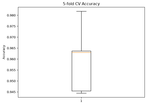
Cross-validation fixes the instability shown above by repeating the evaluation across multiple splits and reporting a distribution rather than a single number.
Show code
from sklearn.model_selection import cross_val_scorecv_folds =5if contact_classifier isnotNoneand min_class_count >= cv_folds: cv_scores = cross_val_score(sklearn.tree.DecisionTreeClassifier(max_depth=3), X, y, cv=cv_folds) plt.boxplot(cv_scores) plt.ylabel("Accuracy") plt.title(f"{cv_folds}-fold CV Accuracy") plt.show()print(f"Mean: {cv_scores.mean():.2f}, Std-dev: {cv_scores.std():.2f}")else:print(f"Need at least {cv_folds} sessions in the smaller class for {cv_folds}-fold CV.")
Mean: 0.96, Std-dev: 0.02
Overfitting: How Deep Should the Tree Be?
The tree above was capped at max_depth=3 somewhat arbitrarily. Sweeping over depth and comparing training accuracy to held-out test accuracy shows why: as depth increases, training accuracy climbs toward 100% while test accuracy plateaus or drops - the textbook shape of overfitting.
Show code
if min_class_count >= min_per_class_for_split: depths =list(range(1, 8)) rows = []for d in depths: tree = sklearn.tree.DecisionTreeClassifier(max_depth=d).fit(X_train, y_train) rows.append({"max_depth": d, "train": tree.score(X_train, y_train), "test": tree.score(X_test, y_test)}) depth_accuracy = pd.DataFrame(rows) plt.plot(depth_accuracy["max_depth"], depth_accuracy["train"], "ro-", label="Train") plt.plot(depth_accuracy["max_depth"], depth_accuracy["test"], "bv--", label="Test") plt.xlabel("max_depth"); plt.ylabel("Accuracy"); plt.legend() plt.title("Decision Tree: train vs. test accuracy by depth") plt.show()else:print("Not enough sessions per class for a train/test overfitting curve yet.")
Comparing Classifiers
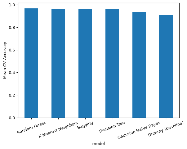
Six classifiers - see Tools and Techniques for what each one does - evaluated with the same cross-validation used above, including a Dummy baseline that always guesses the majority class. If the real classifiers aren’t clearly beating Dummy, they aren’t learning much from the data.
Show code
import sklearn.neighborsimport sklearn.ensembleimport sklearn.naive_bayesfrom sklearn.dummy import DummyClassifierif contact_classifier isnotNoneand min_class_count >= cv_folds: n_neighbors =min(5, min_class_count -1) # can't exceed the smallest class size models = {"Decision Tree": sklearn.tree.DecisionTreeClassifier(max_depth=3),"K-Nearest Neighbors": sklearn.neighbors.KNeighborsClassifier(n_neighbors=n_neighbors),"Random Forest": sklearn.ensemble.RandomForestClassifier(n_estimators=100, max_depth=3, random_state=42),"Bagging": sklearn.ensemble.BaggingClassifier( estimator=sklearn.tree.DecisionTreeClassifier(max_depth=3), n_estimators=50, random_state=42 ),"Gaussian Naive Bayes": sklearn.naive_bayes.GaussianNB(),"Dummy (baseline)": DummyClassifier(strategy="most_frequent"), } comparison = pd.DataFrame([ {"model": name, "mean_accuracy": cross_val_score(model, X, y, cv=cv_folds).mean()}for name, model in models.items() ]).sort_values("mean_accuracy", ascending=False) comparison.plot.bar(x="model", y="mean_accuracy", legend=False) plt.ylabel("Mean CV Accuracy") plt.xticks(rotation=20) plt.show() comparisonelse:print(f"Need at least {cv_folds} sessions in the smaller class to compare classifiers.")
ROC Curves
Accuracy and even F1 collapse a classifier’s behavior into one number at one decision threshold. ROC curves show the tradeoff between true-positive rate and false-positive rate across every possible threshold - the closer a curve hugs the top-left corner, the better. The diagonal dashed line is what the Dummy baseline should trace, since it uses no information from the features at all.
Show code
from sklearn.metrics import roc_curveif min_class_count >= min_per_class_for_split: plt.figure(figsize=(6, 6))for name, model in models.items(): model.fit(X_train, y_train) probs = model.predict_proba(X_test)[:, 1] fpr, tpr, _ = roc_curve(y_test, probs) plt.plot(fpr, tpr, label=name) plt.plot([0, 1], [0, 1], 'k--', label="Random guess") plt.xlabel("False Positive Rate") plt.ylabel("True Positive Rate") plt.title("ROC curves: contact_interest classifiers") plt.legend(fontsize=8) plt.show()else:print("Not enough sessions per class for a held-out ROC comparison yet.")
Tuning KNN
KNN specifically has two things worth tuning: which distance metric it uses, and whether features are scaled first. Scaling matters here because KNN is distance-based, and duration_minutes (ranging up to ~100) would otherwise dominate the distance calculation over links_clicked (ranging 0-5).
Show code
if contact_classifier isnotNoneand min_class_count >= cv_folds: n_neighbors =min(5, min_class_count -1) metric_scores = { metric: cross_val_score( sklearn.neighbors.KNeighborsClassifier(n_neighbors=n_neighbors, metric=metric), X, y, cv=cv_folds ).mean()for metric in ["euclidean", "manhattan", "cosine"] }print(metric_scores)else:print(f"Need at least {cv_folds} sessions in the smaller class to compare KNN metrics.")
from sklearn.preprocessing import StandardScalerif contact_classifier isnotNoneand min_class_count >= cv_folds: X_scaled = StandardScaler().fit_transform(X) n_neighbors =min(5, min_class_count -1) unscaled_score = cross_val_score(sklearn.neighbors.KNeighborsClassifier(n_neighbors=n_neighbors), X, y, cv=cv_folds).mean() scaled_score = cross_val_score(sklearn.neighbors.KNeighborsClassifier(n_neighbors=n_neighbors), X_scaled, y, cv=cv_folds).mean()print(f"KNN mean CV accuracy — unscaled: {unscaled_score:.2f}, scaled: {scaled_score:.2f}")else:print(f"Need at least {cv_folds} sessions in the smaller class to compare scaled vs. unscaled features.")
KNN mean CV accuracy — unscaled: 0.96, scaled: 0.97
Systematic Hyperparameter Search
Rather than tuning one hyperparameter at a time, GridSearchCV searches every combination of a parameter grid at once, cross-validating each - run here for both the Decision Tree and KNN, on both scaled and unscaled features.
Show code
from sklearn.model_selection import GridSearchCVif contact_classifier isnotNoneand min_class_count >= cv_folds: tree_grid = {"criterion": ["gini", "entropy"], "max_depth": [2, 3, 4, 5], "min_samples_split": [2, 3, 5]} knn_grid = {"n_neighbors": [k for k in [1, 3, 5, 7] if k < min_class_count],"metric": ["euclidean", "manhattan", "cosine"],"weights": ["uniform", "distance"], }for label, feats in [("unscaled", X), ("scaled", X_scaled)]: tree_search = GridSearchCV(sklearn.tree.DecisionTreeClassifier(), tree_grid, cv=cv_folds).fit(feats, y) knn_search = GridSearchCV(sklearn.neighbors.KNeighborsClassifier(), knn_grid, cv=cv_folds).fit(feats, y)print(f"[{label}] best tree: {tree_search.best_params_} -> {tree_search.best_score_:.2f}")print(f"[{label}] best knn: {knn_search.best_params_} -> {knn_search.best_score_:.2f}")else:print(f"Need at least {cv_folds} sessions in the smaller class to run GridSearchCV.")
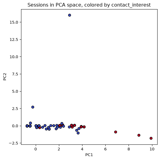
With only 4 features, PCA here isn’t really reducing dimensionality - it’s mainly a convenient way to check by eye whether contact_interest sessions visually separate from the rest at all.
Show code
if contact_classifier isnotNoneandlen(session_metrics) >=2: X_scaled_for_pca = StandardScaler().fit_transform(X) pca_2d = PCA(n_components=2, random_state=1).fit_transform(X_scaled_for_pca) plt.figure(figsize=(6, 6)) plt.scatter(pca_2d[:, 0], pca_2d[:, 1], c=y, cmap="coolwarm", edgecolor="k") plt.xlabel("PC1") plt.ylabel("PC2") plt.title("Sessions in PCA space, colored by contact_interest") plt.show()else:print("Not enough sessions to plot a PCA scatter yet.")
Clustering Sessions into Behavioral Groups
Everything above predicts a label we engineered ourselves (contact_interest). This section instead asks an unsupervised question: without any labels at all, do sessions naturally fall into distinct behavioral groups? Visualizing the Data’s executive summary speculated about “user personas” from a single correlation coefficient - this section checks that claim with an actual model instead.
As with KNN above, these algorithms are distance-based, so features are scaled first:
Show code
from sklearn.preprocessing import StandardScalercluster_features = StandardScaler().fit_transform(X)n_sessions =len(session_metrics)
K-Means: Elbow and Silhouette Methods
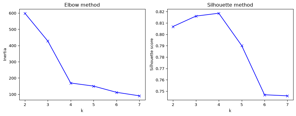
K-means needs to be told how many clusters (k) to look for. The elbow method (inertia - how tightly packed each cluster is) and the silhouette score (how well-separated clusters are) both help pick a reasonable value.
Show code
from sklearn.cluster import KMeansfrom sklearn.metrics import silhouette_scoreif n_sessions >=4: k_range =range(2, min(8, n_sessions)) inertia = [KMeans(n_clusters=k, random_state=42).fit(cluster_features).inertia_ for k in k_range] silhouette = [ silhouette_score(cluster_features, KMeans(n_clusters=k, random_state=42).fit_predict(cluster_features))for k in k_range ] fig, axes = plt.subplots(1, 2, figsize=(10, 4)) axes[0].plot(list(k_range), inertia, 'bx-') axes[0].set_xlabel("k"); axes[0].set_ylabel("Inertia"); axes[0].set_title("Elbow method") axes[1].plot(list(k_range), silhouette, 'bx-') axes[1].set_xlabel("k"); axes[1].set_ylabel("Silhouette score"); axes[1].set_title("Silhouette method") plt.tight_layout() plt.show() best_k =list(k_range)[int(np.argmax(silhouette))]print(f"Best k by silhouette: {best_k}")else: best_k =Noneprint(f"Only {n_sessions} sessions - too few to sweep k meaningfully.")
Best k by silhouette: 4
Show code
# Fit at the chosen k and profile each cluster - this is what turns the "user personas"# language above into an actual finding instead of an eyeballed guess.if best_k isnotNone: kmeans = KMeans(n_clusters=best_k, random_state=42).fit(cluster_features) session_metrics['cluster'] = kmeans.labels_ session_metrics.groupby('cluster')[feature_cols + ['contact_interest']].mean()else:print("Skipping cluster profiling - not enough sessions.")
Hierarchical Clustering
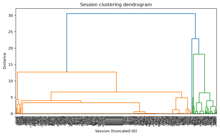
Unlike K-means, hierarchical clustering doesn’t require picking k upfront - it builds a full tree of nested groupings, visualized as a dendrogram. This is especially readable at this dataset’s small session count, where the same dendrogram on a much larger dataset would be unreadable.
Show code
import scipy.cluster.hierarchy as hierarchyif n_sessions >=3: linked = hierarchy.linkage(cluster_features, method='ward') plt.figure(figsize=(8, 5)) hierarchy.dendrogram(linked, labels=session_metrics['sessionId'].str[:8].tolist()) plt.xlabel("Session (truncated ID)") plt.ylabel("Distance") plt.title("Session clustering dendrogram") plt.xticks(rotation=90) plt.tight_layout() plt.show()else:print(f"Only {n_sessions} sessions - too few for a meaningful dendrogram.")
DBSCAN
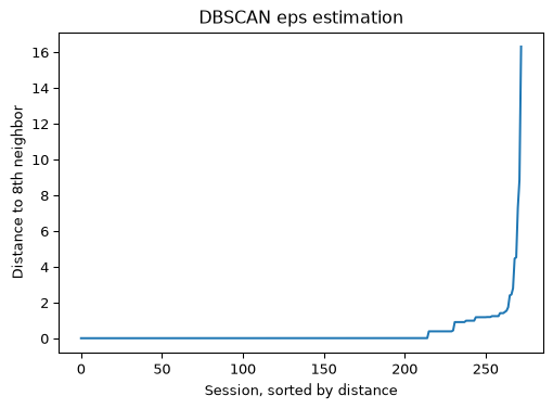
DBSCAN groups points by density rather than distance-to-center, and needs an eps (maximum neighbor distance) hyperparameter, estimated below via a k-nearest-neighbor distance plot and then used to fit the model. With this few sessions, don’t be surprised if DBSCAN finds one giant cluster or labels most sessions as noise (-1) - that’s a legitimate result given the data density, not a bug.
Show code
from sklearn.cluster import DBSCANfrom sklearn.neighbors import NearestNeighborsif n_sessions >=5: n_neighbors_for_eps =min(len(feature_cols) *2, n_sessions -1) # lab 8's own rule of thumb: 2x dimensionality neighbors = NearestNeighbors(n_neighbors=n_neighbors_for_eps).fit(cluster_features) distances, _ = neighbors.kneighbors(cluster_features) distances = np.sort(distances[:, -1]) plt.figure(figsize=(6, 4)) plt.plot(distances) plt.xlabel("Session, sorted by distance") plt.ylabel(f"Distance to {n_neighbors_for_eps}th neighbor") plt.title("DBSCAN eps estimation") plt.show()else:print(f"Only {n_sessions} sessions - too few to estimate a stable DBSCAN eps.")
Show code
eps =1.5# replace with whatever value the elbow above actually showsif n_sessions >=5: dbscan = DBSCAN(eps=eps, min_samples=n_neighbors_for_eps).fit(cluster_features) session_metrics['dbscan_cluster'] = dbscan.labels_ session_metrics['dbscan_cluster'].value_counts()
Anomaly Detection
A different unsupervised question: not “what groups exist,” but “which sessions don’t look like the rest.” Three algorithms - see Tools and Techniques - each flag their own outliers; sessions flagged by two or more are the more trustworthy calls, given how easily any single algorithm can be thrown off at this sample size.
Show code
from sklearn.covariance import EllipticEnvelopefrom sklearn.svm import OneClassSVMfrom sklearn.neighbors import LocalOutlierFactorif n_sessions >=10: outliers_fraction =0.1 n_neighbors_lof =min(20, n_sessions -1) anomaly_algorithms = {"Robust Covariance": EllipticEnvelope(contamination=outliers_fraction, random_state=42),"One-Class SVM": OneClassSVM(nu=outliers_fraction, kernel="rbf", gamma="scale"),"Local Outlier Factor": LocalOutlierFactor(n_neighbors=n_neighbors_lof, contamination=outliers_fraction), } results = pd.DataFrame({"sessionId": session_metrics["sessionId"]})for name, algorithm in anomaly_algorithms.items():try:if name =="Local Outlier Factor":# LOF only supports fit_predict in this mode - no separate .fit() then .predict() labels = algorithm.fit_predict(cluster_features)else: labels = algorithm.fit(cluster_features).predict(cluster_features) results[name] = labels # -1 = outlier, 1 = inlierexceptValueErroras e:# Robust Covariance needs real spread within its "cleanest" data subset to# estimate a covariance matrix at all - real traffic with many near-identical# bounce sessions (single pageview, no scroll, no clicks) can make that subset# exactly degenerate. Skip just this algorithm rather than failing the cell.print(f"Skipped {name}: {e}") resultselse:print(f"Only {n_sessions} sessions - too few to fit anomaly detectors reliably (need >= 10).")
Skipped Robust Covariance: The covariance matrix of the support data is equal to 0, try to increase support_fraction
/usr/local/lib/python3.11/site-packages/sklearn/neighbors/_lof.py:327: UserWarning: Duplicate values are leading to incorrect results. Increase the number of neighbors for more accurate results.
  warnings.warn(
Show code
if n_sessions >=10: algo_cols = [name for name in anomaly_algorithms if name in results.columns] results["flagged_by"] = (results[algo_cols] ==-1).sum(axis=1) results.sort_values("flagged_by", ascending=False)
Show code
if n_sessions >=10: flagged = results[results["flagged_by"] >=2]["sessionId"] session_metrics[session_metrics["sessionId"].isin(flagged)][feature_cols + ["contact_interest"]]
Association Analysis: What Site Behaviors Go Together
A third kind of question, distinct from both prediction and clustering: which site behaviors tend to co-occur within the same session? Each session becomes a “basket” of the distinct events it triggered (e.g. section_viewed:contact, scroll_depth:100), borrowing the same asymmetric-binary-attribute idea used for classic market-basket analysis (which products get bought together).
Building the Baskets
Each session’s events, deduplicated to presence/absence per distinct event:property combo - “did this session ever do X,” not how many times.
Show code
def event_to_item(row): event = row['event'] props = row['properties']ifisinstance(props, dict) andlen(props) >0: key =next(iter(props))returnf"{event}:{props[key]}"return eventmain_site['item'] = main_site.apply(event_to_item, axis=1)# one basket per session: the *set* of distinct items it triggered (order/repeats don't matter)transactions = main_site.groupby('sessionId')['item'].apply(lambda items: set(items)).tolist()all_items =sorted(set(item for t in transactions for item in t))print(f"{len(transactions)} sessions (transactions), {len(all_items)} distinct items")all_items
With only a handful of distinct item types, a brute-force check of every combination up to size 3 is fast enough that a specialized algorithm like FP-growth isn’t necessary.
Show code
import itertoolsmin_support_count =max(2, len(transactions) //5) # tune this - see note belowdef itemset_support_count(itemset, transactions):returnsum(1for t in transactions ifset(itemset).issubset(t))frequent = []for size in [1, 2, 3]:for combo in itertools.combinations(all_items, size): count = itemset_support_count(combo, transactions)if count >= min_support_count: frequent.append({"itemset": combo, "support_count": count, "support": count /len(transactions)})frequent_df = pd.DataFrame(frequent).sort_values("support", ascending=False)frequent_df
itemset
support_count
support
0
(page_load,)
486
0.960474
1
(section_viewed:about,)
147
0.290514
2
(page_load, section_viewed:about)
139
0.274704
Association Rules
For every frequent itemset, every way of splitting it into a left-hand and right-hand side becomes a candidate rule, kept if its confidence (how often the right-hand side follows given the left) clears a minimum threshold.
Read any rules found here skeptically - confidence on a 15-session dataset is extremely noisy (one session flips a ratio by ~7 percentage points), so treat this as “here’s what the mechanism produces,” not “here’s a confirmed finding,” until real production data accumulates.
Show code
support_lookup = {frozenset(row['itemset']): row['support'] for _, row in frequent_df.iterrows()}def proper_subsets(s): s =list(s)return itertools.chain.from_iterable(itertools.combinations(s, r) for r inrange(1, len(s)))min_confidence =0.6rules = []for _, row in frequent_df[frequent_df['itemset'].apply(len) >1].iterrows(): itemset = row['itemset']for left in proper_subsets(itemset): left_key =frozenset(left)if left_key notin support_lookup:continue right =frozenset(itemset) - left_key confidence = row['support'] / support_lookup[left_key]if confidence >= min_confidence: rules.append({"left": left, "right": tuple(right), "support": row['support'], "confidence": confidence})rules_df = pd.DataFrame(rules).sort_values("confidence", ascending=False)rules_df